


In our world of instant gratification and short attention spans, design is a powerful tool to attract and hold an audience’s interest.
Milton Glaser once famously stated that there are only three ways people respond to design: yes, no, and wow. Achieving “wow” takes time, obsession, and creativity. There is no roadmap to “wow” – it happens when it happens.
Luckily, you can build a design system from a core set of principles which will consistently and reliably lead to “yes.”
Read on to learn the principles of beautiful web design…
Negative Space
Negative space refers to the area around an object. Think of negative space as breathing room for the viewer. It doesn’t necessarily have to be white space or empty space, as long as it doesn’t divert your attention.
Negative space gives your page contents importance and prestige. It ensures that your viewers actually appreciate and absorb what you’re showing them, instead of scanning and leaving.

Integrated Branding
Branding adds cohesion and professionalism to your business. It means you carry the same brand message from one asset to the next.
When you think Apple, you think innovation, perfectionism, and simplicity. Whether you go to Apple’s website, or visit them in store, their branding is repeatedly evoked.
A brand identity is a set of elements that allows you to repeatedly evoke your business across disparate places and modalities. Clarification of your brand ID is an essential pre-requisite to beautiful website design.
Once your brand ID is clarified, your designer can maximize every opportunity to integrate this brand ID into your website.

Visual Hierarchy
Of all the principles of beautiful web design, visual hierarchy is probably the least understood. Visual hierarchy involves the utilization of visual cues to stratify your page’s contents into categories and sub-categories.
One of the most obvious methods of laying out visual hierarchy is via size – make the important things bigger. But it’s important to combine size with color, font, and layout to maximize user experience and make it easy to absorb your page’s content.
Visme’s article identifying 12 principles of visual hierarchy is a great in-depth article on visual hierarchy with plenty of detailed examples.

Gestalt Principles of Design
Have you ever wondered why, when you look up at the clouds, you’re often able to draw resemblances to familiar objects? “Gestalt” psychology refers to how our brains interpret and make sense of visual information. There are a number of principles designers can draw from Gestalt psychology to enhance their capabilities.
Here are some important Gestalt principles of design:
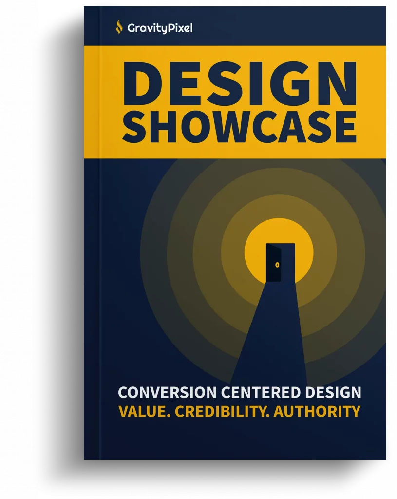
Conversion Centered Design
Marketers that build online sales funnels follow strict metrics in order to maximize “conversions.” A conversion could be anything from a new lead to a sale, depending on the business’s goal.
One of the most important aspects of a marketing funnel is called the “landing page,” which is the page users land on after clicking an ad. Through extensive testing, landing page designers have found a set of design principles that improve the likelihood of a user taking action.
Unbounce, the leaders of landing page building software, identify 7 key principles of conversion centered design: